

A Basic Guide to Force Curves
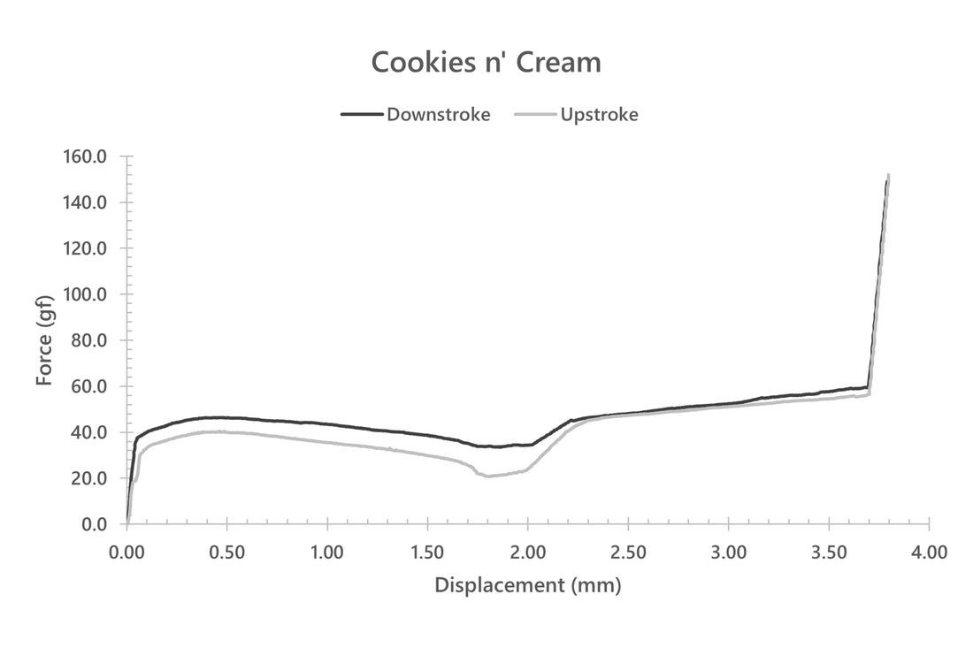
Force curves, with no exception, are the absolute nerdiest and over-the-top way to go about looking into switches. At the absolute highest level, these graphs present a step-for-step representation of how heavy a switch feels underneath your finger at each point within the downstroke and upstroke of a key press. Typically these force curves are not the easiest to initially find on any given sales page, but if they are there, they are located in the manufacturer specification sheets or in community-made diagrams by people such as me (ThereminGoat), Pylon, or HaaTa, to name a few. Force curves come in the form of a simple x vs. y style plot, with force plotted on the y (vertical) axis and displacement plotted on the x (horizontal) axis. These range from the switch at rest (0 grams of force and 0 mm of travel distance) up to whatever the maximum travel distance and bottoming out weight is. In the most traditional representation of force curves, these plots will contain two curves – one for the downstroke (pressing in) of a switch and one for the upstroke (releasing). If not well labeled, the upstroke will always be the lower of the two curves. In an alternative representation which I will use further on in this article, known as a ‘Butterfly Style’ force curve, the upstroke curve is reflected over the vertical axis to allow a separation of the two curves for a less crowded comparison of different types of switches.

Figure 1: DK Creamery Cookies n' Cream traditional style force curve diagram.
These force curves that you will see here and in other formats are all collected by instruments known as ‘force displacement testers’. Considering them as nothing more than a scale taped to an up and down moving arm, these instruments are highly calibrated to report the force of an object being pressed into the scale and the exact distance the arm was moved to record that value. This high correlation between force and displacement produces the combination of data used to make these graphs. In an example that might be pushing the boundaries of understanding just a little bit, let’s go ahead and consider a basic linear switch. You press it in, you bottom out, and then you release. Straight up and straight back down with a similar resistance the entire way. Since the spring inside of this switch is the vast majority of what is causing the force in that switch, and it feels consistently heavier as you press it in further, it produces a straight-line force curve as you can see below in Figure 2. As you may be able to guess, as well, since tactile switches have stems that interact with the leaves of a switch in addition to the spring itself, they produce non-linear force curves!

Figure 2: Strawberry Milk Ice Linear force curve diagram
With that previous force curve for the Strawberry Milk Ice Linear in mind, you likely already have come to the conclusion that you could identify a linear versus a tactile switch just by looking at a force curve. While this is correct, there’s even finer detail that can be parsed out of these graphs if we take a second to consider. Looking at the downstroke (or top) curve for Figure 3, below, we can see it spans from 0.000 mm to around 3.25 mm going from left to right. Since a switch starts in rest at 0 and then is pressed in until it travels its full length, this means that this spike in force at 3.25 mm tells us not only how far a switch’s travel is, but what its bottom out force is as well! (The spike in force being due to the machine trying to push through the bottom of the switch even though it can’t.) Using a similar understanding, you can also identify the peak tactile force of a tactile force curve such as this example switch and where in a downstroke you would feel it. While my force curve machine does not have this functionality, some other curves you may see will also mark or report an ‘actuation force.’ This is a force somewhere between the start and bottom out where the switch would register a stroke in your keyboard as switches actually do this before bottoming out.

Figure 3: Strawberry Milk Ice Tactile force curve diagram.
Not to feel as if I’ve cut it short on you, in the slightest, that is really all there is to need to understand about force curves in order to extract immediately useful information out of them! While there is finer depth and detail to certain force curve features such as the slope of the downstroke, the separation of the upstroke and downstroke, and so on, these are more advanced topics for another time. Many people often start out not just by reading force curves one by one, but rather comparing two of them side by side in much the same fashion as they would directly compare switches. Comparisons can be as simple as comparing the bottom out force between two linear switches and as complex as comparing the differences in width and peak tactile force of different tactile switches. You can even go as far as to compare different types of specialty springs such as progressive springs, multi-stage springs, etc. by simply looking at the bottoming out of two switches with different springs side by side or overlapped in my favorite butterflystyle diagrams. As for what some of these interesting comparisons might look like, I’ll leave you with a few below, but the rest of the exploration will be entirely up to you!
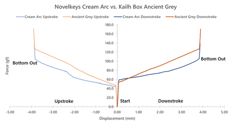
Figure 4: Novelkeys Cream Arc and Kailh Box Ancient Grey 'Butterfly Style' force curve diagram

Figure 5: DK Creamery Cookies n' Cream and Cherry MX Brown 'Butterfly Style' force curve diagram.
Links to Force Curve Repos:
HaaTa: https://chart-studio.plotly.com/~haata
Pylon: https://github.com/bluepylons/Open-Switch-Curve Meter/tree/main/Force%20curve%20measurements
ThereminGoat: https://github.com/ThereminGoat/force-curves